Vol. 1 / Issue 9
Design Tips: Fonts 101
 How much do you know about fonts? You may be surprised to know that there is much more to a 'font' than meets the eye. This edition will hopefully shed some light on some finer focused font facts.
Not many will look beyond a font for more than its face value. What many people don't realize is that fonts are subconsciously making them feel one way or another about whatever it is the font is representing. Fonts are powerful tools and when used properly, can greatly benefit the user. Because of this fact alone, it is necessary to delve into fonts and find out what makes them tick.
What Is A Font?
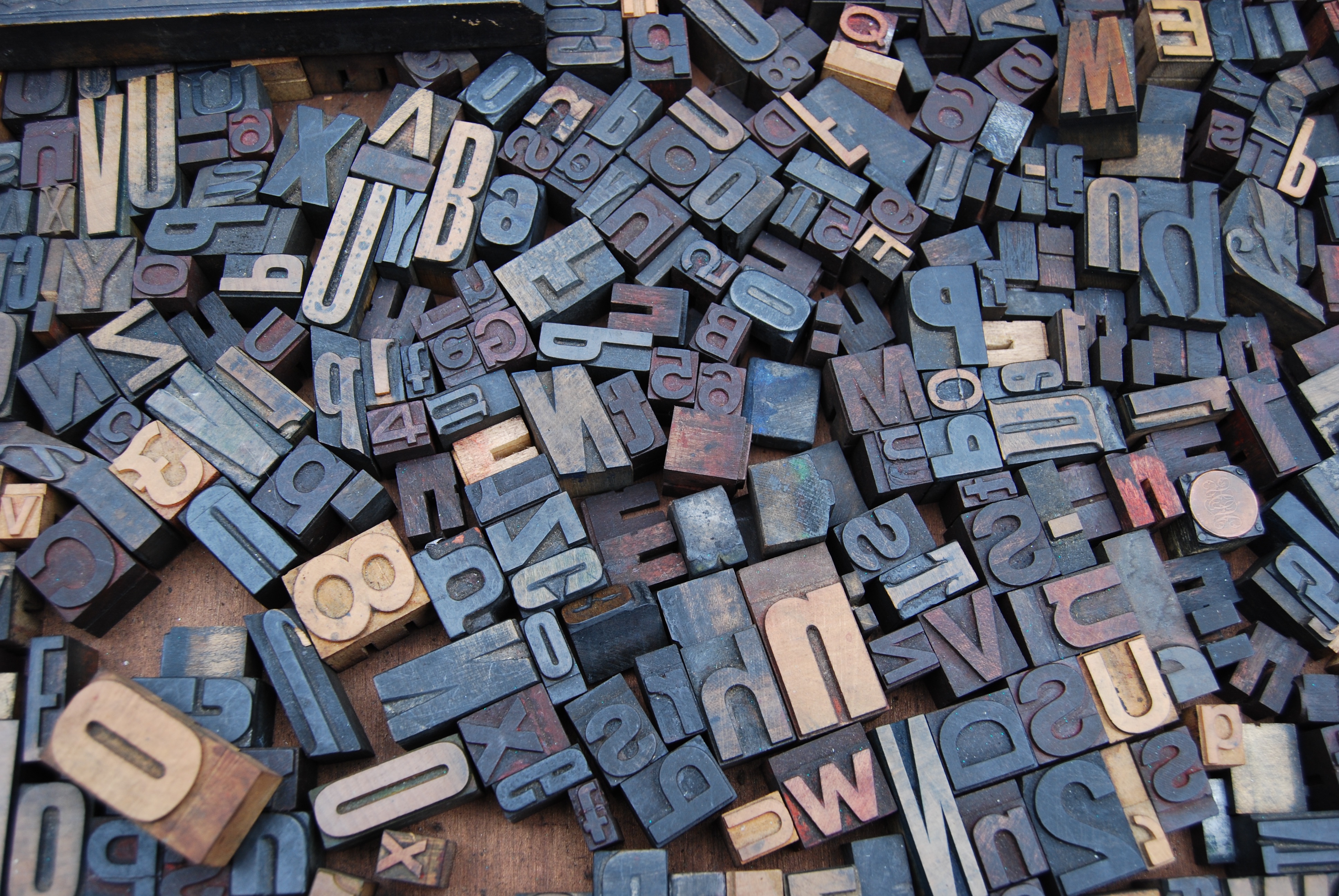
Fonts refer to a set of type of one particular face and size.
The key word here is type. Most times, what people call fonts, are actually part of a larger group of variants, called typefaces, or type families. These larger groups will often be a collection of variants which are referred to as weights.
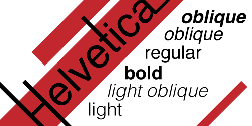
Helvetica (typeface) and some of its different weights.
The typeface Helvetica, for example, has several different weights that make up the typeface. These separate fonts, or weights, can vary greatly from typeface to typeface. Typefaces may have many different weights, such as Helvetica. If a font is a stand-alone piece, then it would be incorrect to refer to it as a typeface until such a time when other weights were created for it. Beyond the different weights, typefaces are made up of different elements that makes each one unique.
Typographic Anatomy
The different pieces and elements of typefaces and fonts are referred to as the anatomy, or typographic anatomy. Much like how people have anatomy, so do letters. Some terms are even borrowed such as shoulder, or ear. Each piece of anatomy defines a typeface. Its how these pieces are created that defines how the typeface will look as a whole.

Font Types
So now we know more specifically what a font is, and what makes up the font. But what type of fonts are there? The two most basic categories are serif and sans serif. Now that you know more about the anatomy of typefaces, if you reference back to figure 9 on the above chart, you can see in red the small ending of the letter "h". That particular part, which is found on most letters in the word "Typographic" is called a serif. If you compare "typographic" to "anatomy" you can see the clear absence of serifs. Beyond these two classifications, there are script fonts which can be formal or informal, black letter fonts based on medieval handwriting, display fonts for headings, and many many more.
Types of fonts:
Serif: Serif fonts are highly legible, and able to be used in both formal and informal situations, for headers, and for body copy. They are recognizable by the ends of letters which are decorated with serifs, from which the fonts take there name.
Sans Serif: Sans Serif fonts are similar to Serif fonts in base structure, but they lack the serifs that distinguish their cousins. These fonts are often seen as more contemporary and often are used by designers in eye catching typographic work.
Script: Script fonts mimic the penmanship of days past. These can be highly formal and ornate, and as such should be used sparingly. A little can go a long way. The more playful versions have wonderful utility.
Black Letter: Black Letter fonts are normally used to achieve a specific formality or severity. They are often based on historic writing samples. They are what many people mistakenly refer to as "Old English," even though there is a font by that name.
Display: Display fonts are meant to catch the eye. They can often time have elements that would make them difficult to read in body copy, so these guys are best left to titles and headers to draw the reader in with something catchy.
Choosing A Font
When it comes to choosing a font, there are certain factors to consider.
The Size: What are you doing with this font? Is it on a business card, or something large like a poster? The type of font you choose can make or break your project before it even gets off the ground.
- Choose a font size appropriate to your project.
- Be mindful of busy fonts that may look cluttered in a small space.
- Where will the project be viewed?
The Type: Perhaps most important is the style of font you choose. Don't use an inappropriate style of font for something such a wedding or special event. People will notice.
The Font: The font itself should speak to the reason you are using it. It should convey the message along with the actual copy.
- Do not use more than three fonts.
- Do mix serif and sans serif fonts, the contrast looks great.
- Be mindful of the audience seeing the work.
AVOID USING THESE FONTS:
- Comic Sans
- Papyrus
- Curlz
- Viner
- Apple Chancery
- Zapf Chancery
- Brush Script
Fonts have the most potential to relay information. Utilizing them properly is a sure fire way to help your brand explode into something huge. If you still have questions about fonts, please call, email or come in today to let our specialists help you!
Phone: 734-663-6816 • Toll-free: 800-696-9627 • Email: Info@advprint.com